Toyota’s Concept-i
Philosophy, passion, and purpose converge with a host of new and emerging technologies to offer a glimpse of tomorrow’s car today
Cars aren’t what they used to be—and they certainly aren’t what they’re going to be. Which means we find ourselves at a hinge in automotive history. Just how far and fast that hinge swings is a matter of debate, but what’s not subject to debate is the unprecedented coming together of technologies that are enabling—if not driving—the massive disruptions occurring in the auto industry right now.
And while there’s no question that these disruptions will alter the way we drive, do they also signal a wholesale departure from a century of car culture? Or could it possibly mean a return to it? You know, the days of driving for the pure pleasure of it. It seems the Sunday drive I remember as a kid with the family in the Buick wagon is now a relic of a bygone era. Societal changes have had a lot to do with that (who has time for a Sunday drive anymore, to say nothing of paying the fuel costs?), but maybe driving around in cars just isn’t as fun as it used to be.
Has the automobile come to a point of simply performing a utilitarian function? The vast majority of cars on the road today would suggest so. So what, then, do we really have to look forward to? Well, let’s take a look ahead and find out. But first, perhaps a look back at looking ahead will provide some helpful perspectives.
Our case in point is the February, 1951 issue of Popular Science, which featured a short article about a concept vehicle—a “Preview Car”—dubbed the LeSabre. A product of Harley Earl’s fabled studio, it took its styling cues from jet aircraft (we’d just entered the jet age, after all), with a tail fin motif borrowed from Earl’s Cadillac Sixty Special of 1948, a feature inspired by the twin vertical stabilizers of the P-38.
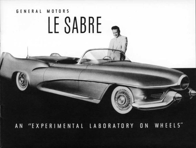
“You can’t buy this beauty,” opened the copy, although Earl appropriated the car as his personal daily driver, “but you can expect to see many of its features turning up on cars in the years to come. Now being completed by General Motors, the hand-built, super-styled car will serve as a rolling laboratory for engineers to test out new ideas in design and equipment. Its special high-compression (10 to 1) V-8 engine plus supercharger is expected to deliver 300 hp. Built-in hydraulic wheel jacks, electric seat warmers, and a rain-sensitive switch that will automatically put up the top are just a few of today’s novelties that may become commonplace tomorrow. After all, an earlier 1938 GM version was the first U.S. car to boast an electric top, curved-glass windows, and push-button door latches—now taken for granted.”
It was indeed an exciting prospect in 1951. And it did indeed take some time for many of its innovative features to find their ways into production cars. Not even the name LaSabre would appear on a production vehicle until 1959!
Not much has changed in the 66 years since the original LaSabre—or the 79 years since Earl’s 1938 Buick Y-Job, briefly referenced in the Popular Science story and widely regarded as the seminal concept car. But then again, that’s why they’re called concept cars; they’re about showcasing what could be.
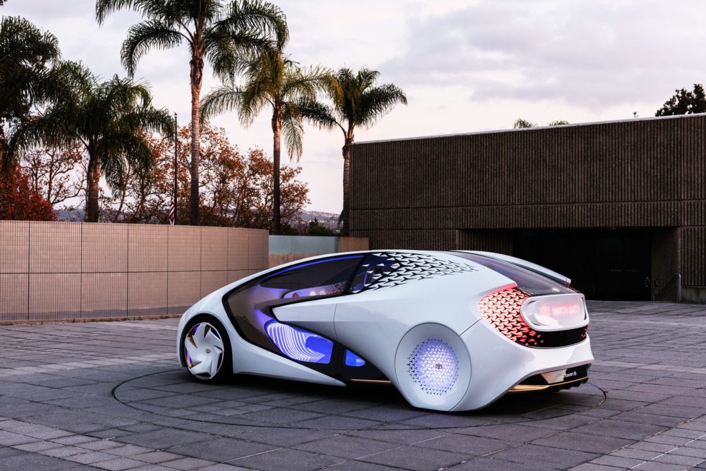
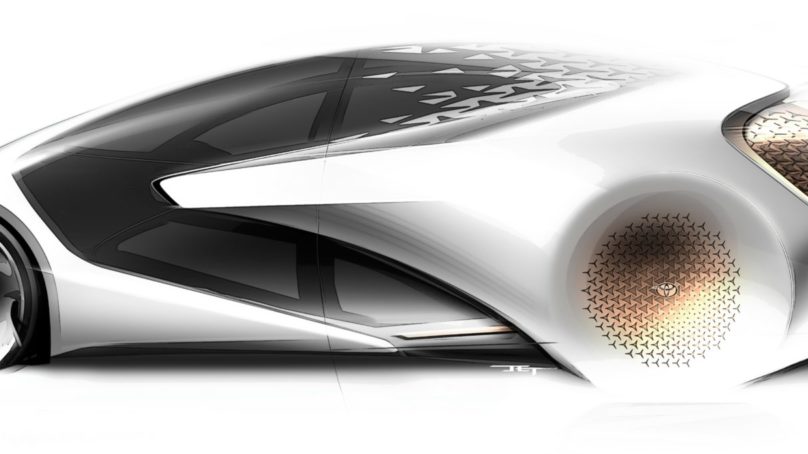
Which brings us to Toyota’s radical Concept-i—a vision of the automotive future 13 years out. And what a vision it is. Aside from the astounding array of new technology that the vehicle exhibits, at its heart is a fundamentally redefined relationship between car and driver, man and machine. In short, it’s a vision of the automobile as partner.
There’s a certain inevitability about the technological future, but there’s also a certain ineffability about it that makes its articulation somewhat challenging. That’s why we have science fiction writers. But the Concept-i is no fiction. A tangible expression of the future in the here and now, it reels in far-flung potential and brings it up close and personal.
It’s a car where command and control give way to conjuring and collaborating: functions appear seemingly out of the ether and sublimate when no longer needed. It’s a car that begs to be driven, yet simultaneously appears to need no help from a biological unit of any kind. It’s a car that even when standing still, is a study in motion. Such contradictions are to be expected at the edges of disruptions.
Ian Cartabiano, right, chief designer at Toyota’s California-based Calty studio.
Intrigued, I sat down with the car’s creators, Ian Cartabiano, chief designer at the Toyota’s California-based Calty studio (Calty being a contraction of California and Toyota), and Project Design Manager William Chergosky, who was responsible for much of the UX and interior design, to learn more.
Both men are longtime veterans of the car design craft and have worked together on myriad projects spanning the exotic to the more domesticated likes of the Camry. Perhaps that’s one reason why when sharing the experience of designing the Concept-i, they frequently finish each other’s sentences. Indeed, in the process of conceptualizing the Concept-i, it is obvious that they developed a unity of both mind and purpose—an attribute that is equally and obviously manifested in the result.
***
Gentlemen, first of all, congratulations on a tremendous achievement with the Concept-i. Are you happy with the outcome and the reception it’s received?
Ian: We’re very happy with the outcome. We really pushed hard for two years to debut this car at CES 2017. We wanted to be out there with a message about the future of the automobile that’s different from everyone else’s. And frankly, that could have gone either way, but our message seems to have resonated. Still, I’m a little surprised at the reception, how positive it has been. People came up to us at CES to tell us how the car makes them feel when they see and experience it, which is what we had in mind when we created it. It’s a really great connection. And the fact that the car got seven “Best of CES” awards, well, I’ll be honest, it feels good.
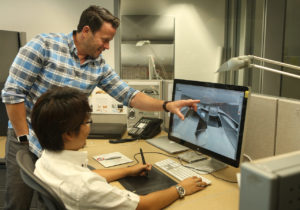
Project Design Manager William Chergosky, left, who was responsible for much of the UX and interior design.
Broadly speaking, how would you characterize this vehicle?
Ian: Concept-i is Calty’s vision of what a future Toyota and a future fun-to-drive vehicle can look like in the year 2030. It was a vision that connects driver with car through a very advanced and intelligent user interface and AI, but in a friendly, warm, engaging, and intriguing way. That was the big overarching statement of the car. We’re envisioning a future car that has an autonomous feature, but where fun-to-drive is still key—the driver is always in control. It’s a positive, forward-looking vision of the future.
Before we get too far into the future, let’s back up a bit. Take us to the genesis of the project.
Ian: Bill and I actually spent months debating philosophy with the design team. There were no sketches made until we got the story down. We were still fleshing it out as we were developing the car, but basically we wanted to get the philosophy, the direction, and the vision clear before anybody started creating.
Good strategy!
Ian: Yeah! It was a very different design approach for us. And we think it served us well. At CES, you said when you saw the car that everything rings true. That was our goal. Everything connects from start to finish. It’s a really unified message. When you spend the time getting the concept correct, everything else follows.
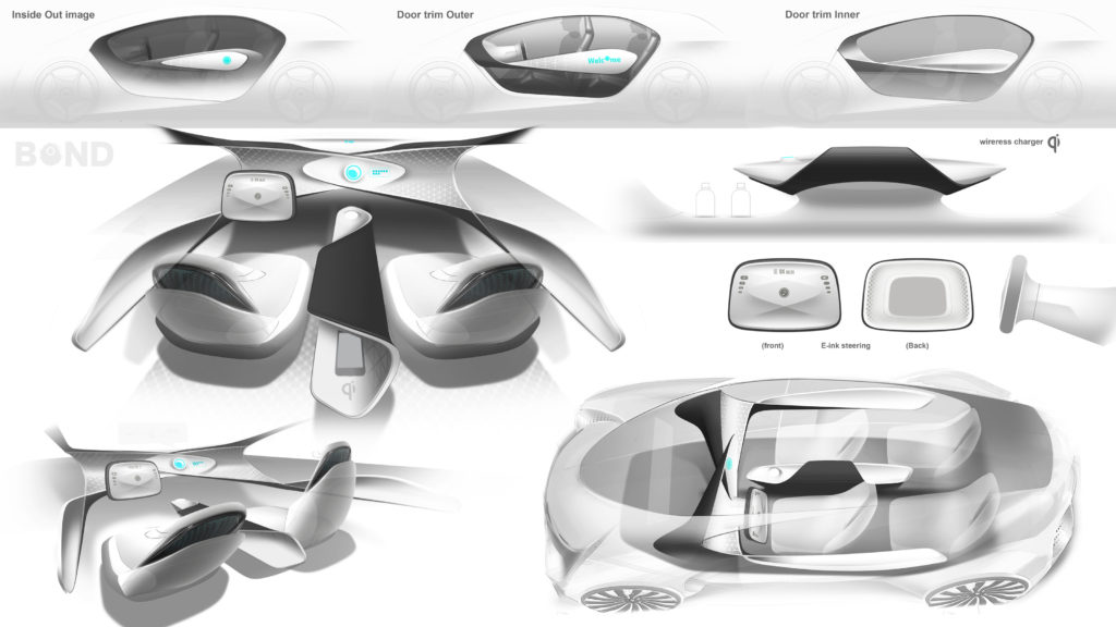
Early interior concepts.
Bill: We did define a very clear future. I don’t want to say it was easy, but ultimately our roadmap became simple to measure—does it achieve our goals or doesn’t it?
What were the guiding principles and form language that steered the design?
Ian: Two things came up at the beginning of the project. First, we came up with the keyword, “kinetic warmth.” That was important because that keyword defined the entire project—everything you see in the car from the AI to the interior design to the exterior design to the color of the materials and to the finish of the graphics. Kinetic warmth stands for something that feels energetic and alive and moving—that’s the kinetic part. The warmth is a unique element: it brings something to the car that is humanistic, friendly, and a little bit magical in a way. And then we sought to combine those attributes in creating something that’s different from what everybody else has been doing for CES and other auto shows.
Bill: When we looked at where the industry was going, when they show “the future” we always see an aluminum box with maybe four wheels, like a pod. You get in and you’re shut off from society; you’re surrounded by screens, you get shuttled from point A to point B, and that’s it. We did not want to make a laptop or a cellphone on wheels. We wanted to remove the tyranny of the black screen on the dashboard or anywhere else in the vehicle. We’re already surrounded by smartphones and laptops and screens all day, even when working at home. So we thought, let’s create a space where we’re not flooded by data.
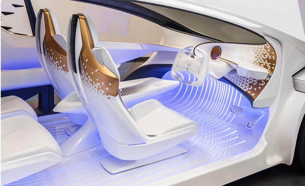
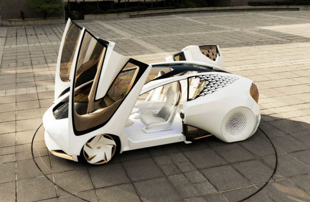
Ian: Exactly. And consistent with that, in addition to the concept of kinetic warmth, we came up with a different way to design that we called “design from the inside out.” Usually when we design a car we have a packaging; we do the exterior shape and we do the interior design that matches the exterior shape, and then if there’s time, the user interface and graphics. But in the case of this car, once we developed the kinetic warmth keyword, we said we’re going to do this car differently; we’re going to design it from the inside out. When you see the car in real life, as compared with photos, you can really get a sense of that inside-out movement, that constant connective tissue of surface that links the interior to the exterior to the wheels, back to the cabin and constantly looping around the car.
Those are big, broad objectives. How did you work this out at the drawing board?
Ian: We actually started with the AI-driven user interface, which we call Yui. We came up with that first. We thought long and hard about what type of communication agent should represent our advanced AI. In thinking about something that is warm and lively and engaging and friendly but also simple and universal, we went through a lot of variations and a lot of crazy shapes, but in the end we went back to the humanistic art form of animation. We started with a simple 2D graphic, but we animated it so it looked like it was alive. Think of the UI as comprising an outer ring and an inner circle. The outer ring represents the body, and the inner circle represents the soul. But it also represents the car and the driver inside, and the way the two interact. The UI communicates through voice but also through imagery, and in doing so, we made an inanimate object feel alive. That was the starting point. Ultimately, though, it’s about what kind of future are we going to show; what is Toyota going to be in the future? Driving is important, fun-to-drive is important. 2030 sounds really far away, but its only 13 years away.
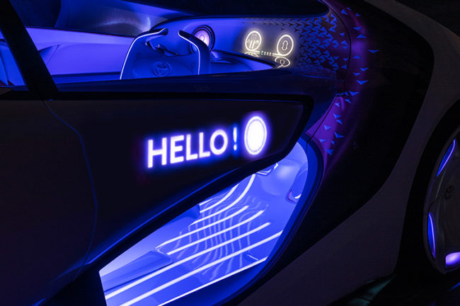
Bill: We wanted to plant a flag to signal a very different direction with this vehicle. This is not just a tool that gives you information and moves you from A to B. It’s an immersive experience meant to not only improve the driving experience, but to improve your life.
Most of the talk around AI in the context of cars is about autonomous operation. But you’re inverting that model, making the driver experience inside the car the focus of your attention.
Ian: Yeah, I’m glad you got that. But in the end, we’re a car company. There is a lot of talk about “cars are going to disappear,” or everything is going to be about sharing. Maybe that can happen in San Francisco and Los Angeles and New York. But there are still large parts of the country and the world where driving is still essential; it’s still the way to get from place to place. But certainly there are times when you don’t want to drive. Bill and I have the world’s worst commute from opposite directions getting to work. I don’t love driving on the 405 Freeway. I’d rather not. But there are times when I love it and I want to have that experience, whether it’s driving through the desert or driving up the Pacific Coast Highway to Monterrey. That’s still a fun activity; it’s an exploring activity. It’s even therapeutic. We don’t want to lose that.
That’s good news. Tell me more about the human-machine interface you set out to create.
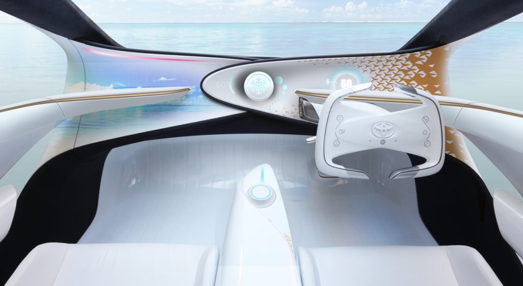
Bill: It’s about demonstrating metaphorically the relationship between the human and the car. As you enter the vehicle, the center console “grows” out of the floor surface. We call that the hand—it’s the initial interaction point you have with Yui. You put your hand over it and the surface grows and reaches up and you touch it and it touches you as well, via a novel haptics system. At that moment, you sense its “life force.” The light it emits shoots up to the instrument panel, wakes it up, the head-up display activates, and the car comes to life. It’s not unlike meeting a person and shaking hands; there’s an interaction and moment of recognition that occurs. That’s the idea we’re trying to convey with Yui.
Ian: You’ll also notice the white ceramic appearance to everything inside the car. There’s also a heavy use of a pattern that is meant to convey this sense of technology with movement that spills out toward the edges. And by using gold in the pattern with the white ceramic, you get this nice interplay between futuristic and ancient materials. We didn’t want the typical chrome or aluminum or anything cold and sterile. The combination of the gold and the white ceramic conveys that sense of human craft. It looks like a human hand made the car. It looks like a piece of ceramic sculpture.
 I can see that this same philosophy carried forward to the exterior.
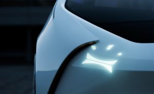
Ian: Absolutely. As an example, you saw the car winking, right? We used a simple headlamp graphic to convey personality and create a bond with the owner, the driver, the passenger. But also you saw that there were no distinct headlamps on the face of the car. The lighting on the front, the messaging on the side, the messaging on the rear, just like the interior, magically comes from nowhere. It’s all through really cool technology that we developed to have the lighting come from behind the paint. And like the interior, when the car comes to life, the lamps open up, and as you approach it, it greets you with a wink. When you start driving faster, the shape of the lamps angle in; they get a little more set and aggressive.
Bill: This is not at all the idea of a linear progression from where we see technology today. As I mentioned earlier, technology today means we’re all inundated with devices and information. Our thesis is that in the future, technology becomes smarter, and we’re not looking to bury you in information, like some sort of Mission Control. So out of that white ceramic you see the meters and messaging appearing and disappearing in a very cool and engaging way.
Ian: What makes technology approachable is not only making it humanistic and warm but also bringing back the wow. That’s when people get excited about tech and welcome it into their world. Yes, it helps them, it but still has that magical element to it. And that idea fed into the design language.
Speaking of welcoming new technology, with the advent of the autonomous vehicle, there’s a lot of debate about the future fate of the steering wheel. How did this consideration get worked out in your design philosophy?
Ian: Against the grain of what a lot of future think is, the steering wheel in Concept-i doesn’t go away. That’s a unique point in our vehicle. This vehicle represents a vision of the future where driving is still a passion. And there’s a functional element to it as you transfer from mode to mode. Whether its autonomous level 2, 3, 4, or 5, you need to be able to grab the wheel. The time it takes for the wheel to deploy in these open-close systems might be too slow and you may actually end up getting in an accident. So there are these functional and emotional reasons for the wheel to always be there.
The wheel in the Concept-i also plays host to some interesting UI technologies.
Bill: Yes, and contextually, the information that is displayed on the wheel is only there when you need it, as are the audio and climate control functions. This was actually inspired by a Japanese concept called “omotenashi”—service on demand; it just appears seamlessly. The technology comes up and goes away when you don’t need it. That magical element was a great way to break away from the linear path of today to this expressive, kinetic future that we envision.
Ian: It’s about service that is so perfect that it is almost invisible. It’s basically hospitality at the right time, when you need it, in the right amount, served in a beautiful way. And when you’re done, it disappears.
That leads me to ask about another invisible feature: the haptics you’ve built into the user experience.
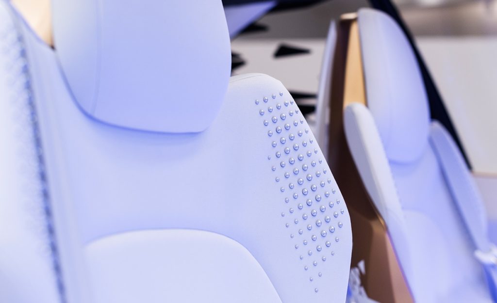
Bill: It’s a safety technology we pioneered. We’ve built haptic feedback into the shoulder of the seat, and it will actually physically tap you and give you an alert when, for example, something is going on in your blind spot or behind the car when you’re backing up.
Ian: And the type of tapping, its resonance, speed, and pitch, depends on the severity or the type of alert it’s generating. The tapping is actually an ultrasound pulse whose frequency we can tune to give a unique, distinctive tapping feel appropriate to the situation. If it’s tapping hard and fast on your shoulder, you know there’s some immediacy to what it’s requiring of you. If it’s just a gentle, soft tap, it might be something very minor. The car can also assist you as you’re dozing off, through another technology we’ve built into the car. If the car sees that you’re starting to doze off, it will tap you and ask you questions and keep you awake and engaged.
So you’ve also integrated biometric sensors with the haptic tapping, enabled, I presume, by deep learning technology that monitors the driver’s physical state?
Ian: Exactly. The car has five cameras in the interior. They track your eye movement, your blinking rate, your respiration rate. The seat can take your temperature, your pulse rate. There are also audio sensors that can tell if you’re talking aggressively or with anger or frustration. If your behavior behind the wheel is erratic or otherwise of concern, Yui will ask if this might be a good time for it to take over. And it can be helpful in other ways. For example, it knows your schedule and knows that you’ve had a long day and that it’s been nine hours since you’ve eaten lunch. Through your social media feed or searches or conversations with Yui—or even conversations with friends in the car—it remembers that you want to try this new restaurant on the way home. So there are many ways the car can become a partner.
Bill: Yui can actually engage in a conversation with you. For example, if you’re going on a road trip, a ten-hour drive, it’ll play the license plate game with you. It’s all about keeping the driver focused and alert. Yui can do that.
Ian: Going back to the autonomous capability, a key point is that Yui will ask you if it can take over. We still want the driver to be in control. If all else fails, the car will take over. It will not let you crash. Driving is not fun if you don’t feel safe. All of our autonomous technologies, and the things the people at TRI [Toyota Research Institute] are working on—a zero-accident future—are first and foremost about safety. We think that’s another way where this concept of car as partner can improve your life—by actually saving your life.
Let’s move to the exterior of the vehicle. The inside-out design motif manifests itself first in the glass.
Bill: Yes. The glass is really just a plane to keep the outside from getting in, but the surfacing is all a singular, unified shape, like the human body where your arm connects to the torso, your torso to your waist. It’s not delineated into separate parts. So while the glass just serves a function to keep things out, sculpturally, it is one singular element.
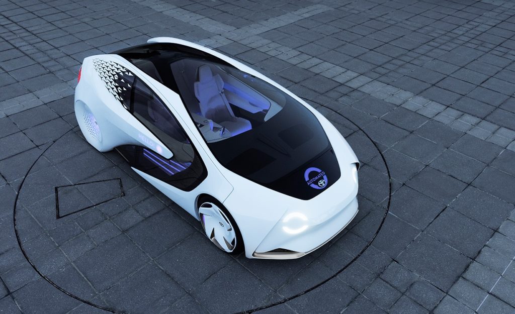
Which brings us to the aerodynamic principles that steered the design. It’s gorgeous, but to what extent does form follow function? How did you manage or balance the tradeoffs between aesthetics and aerodynamic performance?
Ian: The aerodynamic performance is excellent because it is a very simple shape. I don’t want to compare it to the Prius but there is an ideal profile for aerodynamic performance, and this car follows that profile, which is not only for a low drag coefficient, but also for high-speed stability.
Bill: Another important point on the topic of form following function is that this car seats four adults comfortably. A lot of times show cars are so cheated; not many people can fit in them, or if you can, you have to really cram yourself into them. We packaged this car around four adults. So when you get in the car and the doors close, it’s a wonderful space to be in. I actually found it to be soothing and calming to be in the car during CES. It was a nice serene environment to try to escape the chaos of CES!
I know just what you mean! Your design objectives were very ambitious and it is evident that you’ve achieved them. But it’s interesting that in all this conversation, we’ve not spoken about the drivetrain, which seems almost a secondary consideration…
Ian: Right now all we’re saying is it is a zero emissions vehicle.
Fair enough! So for the moment what’s under the hood is staying under the hood. So which of the Concept-i features will we see start making their way into production vehicles first?
Ian: Well, this vehicle represents a vision. We’re not going to put this car into production. But a lot of the things that you saw and experienced are being researched and developed right now, so you may see some of those things in the near future. And we know that the future is coming!


